ePSproc - basic plotting development, XC version
03/07/20, simplified version to look at XC data and betas only.
28/06/20, v1 http://localhost:8888/notebooks/github/ePSproc/epsproc/tests/plottingDev/basicPlotting_dev_280620.ipynb
Aims
Improve/automate basic plotting routines (currently using Xarray.plot.line() for the most part).
Plot format & styling (use Seaborn?)
Test & implement plotting over multiple Xarrays for data comparisons. (E.g. XeF2 plotting, updates to follow when AntonJr is back up.)
Conversion to Xarray datasets?
Use Holoviews?
Improve export formats
HV + Bokeh for interactive HTML outputs (e.g. benchmarks graphs via xyzpy).
Setup
[2]:
# Standard libs
import sys
import os
from pathlib import Path
import numpy as np
import xarray as xr

from datetime import datetime as dt
timeString = dt.now()

# For reporting
import scooby
# scooby.Report(additional=['holoviews', 'hvplot', 'xarray', 'matplotlib', 'bokeh'])
# TODO: set up function for this, see https://github.com/banesullivan/scooby
[3]:
# Installed package version
# import epsproc as ep

# ePSproc test codebase (local)
if sys.platform == "win32":
    modPath = r'D:\code\github\ePSproc'  # Win test machine
else:
    modPath = r'/home/femtolab/github/ePSproc/'  # Linux test machine

sys.path.append(modPath)
import epsproc as ep
* plotly not found, plotly plots not available.
* pyevtk not found, VTK export not available.
[4]:
# Plotting libs
# Optional - set seaborn for plot styling
import seaborn as sns
sns.set_context("paper")  # "paper", "talk", "poster", sets relative scale of elements
                        # https://seaborn.pydata.org/tutorial/aesthetics.html
# sns.set(rc={'figure.figsize':(11.7,8.27)})  # Set figure size explicitly (inch)
                        # https://stackoverflow.com/questions/31594549/how-do-i-change-the-figure-size-for-a-seaborn-plot
                        # Wraps Matplotlib rcParams, https://matplotlib.org/tutorials/introductory/customizing.html
sns.set(rc={'figure.dpi':(120)})

from matplotlib import pyplot as plt  # For addtional plotting functionality
# import bokeh

import holoviews as hv
from holoviews import opts
Load test data
[5]:
# Load data from modPath\data
dataPath = os.path.join(modPath, 'data', 'photoionization')
dataFile = os.path.join(dataPath, 'n2_3sg_0.1-50.1eV_A2.inp.out')  # Set for sample N2 data for testing

# Scan data file
dataSet = ep.readMatEle(fileIn = dataFile)
dataXS = ep.readMatEle(fileIn = dataFile, recordType = 'CrossSection')  # XS info currently not set in NO2 sample file.
*** ePSproc readMatEle(): scanning files for DumpIdy segments.

*** Scanning file(s)
['/home/femtolab/github/ePSproc/data/photoionization/n2_3sg_0.1-50.1eV_A2.inp.out']

*** Reading ePS output file:  /home/femtolab/github/ePSproc/data/photoionization/n2_3sg_0.1-50.1eV_A2.inp.out
Expecting 51 energy points.
Expecting 2 symmetries.
Scanning CrossSection segments.
Expecting 102 DumpIdy segments.
Found 102 dumpIdy segments (sets of matrix elements).

Processing segments to Xarrays...
Processed 102 sets of DumpIdy file segments, (0 blank)
*** ePSproc readMatEle(): scanning files for CrossSection segments.

*** Scanning file(s)
['/home/femtolab/github/ePSproc/data/photoionization/n2_3sg_0.1-50.1eV_A2.inp.out']

*** Reading ePS output file:  /home/femtolab/github/ePSproc/data/photoionization/n2_3sg_0.1-50.1eV_A2.inp.out
Expecting 51 energy points.
Expecting 2 symmetries.
Scanning CrossSection segments.
Expecting 3 CrossSection segments.
Found 3 CrossSection segments (sets of results).
Processed 3 sets of CrossSection file segments, (0 blank)
Xarray plotting
Xarray wraps Matplotlib functionality. (And can be modified using Matplotlib calls, and will pick up Seaborn styling if set.)
Easy to use, supports line and surface plots, with faceting.
Doesn’t support high dimensionality directly, need to subselect and/or facet and then pass set of 1D or 2D values.
Not interactive in Jupyter Notebook, or HTML, output.
[8]:
# Plot with faceting on symmetry
daPlot = ep.matEleSelector(dataXS[0], thres=1e-2, dims = 'Eke', sq = True).squeeze()
daPlot.plot.line(x='Eke', col='Sym', row='Type');
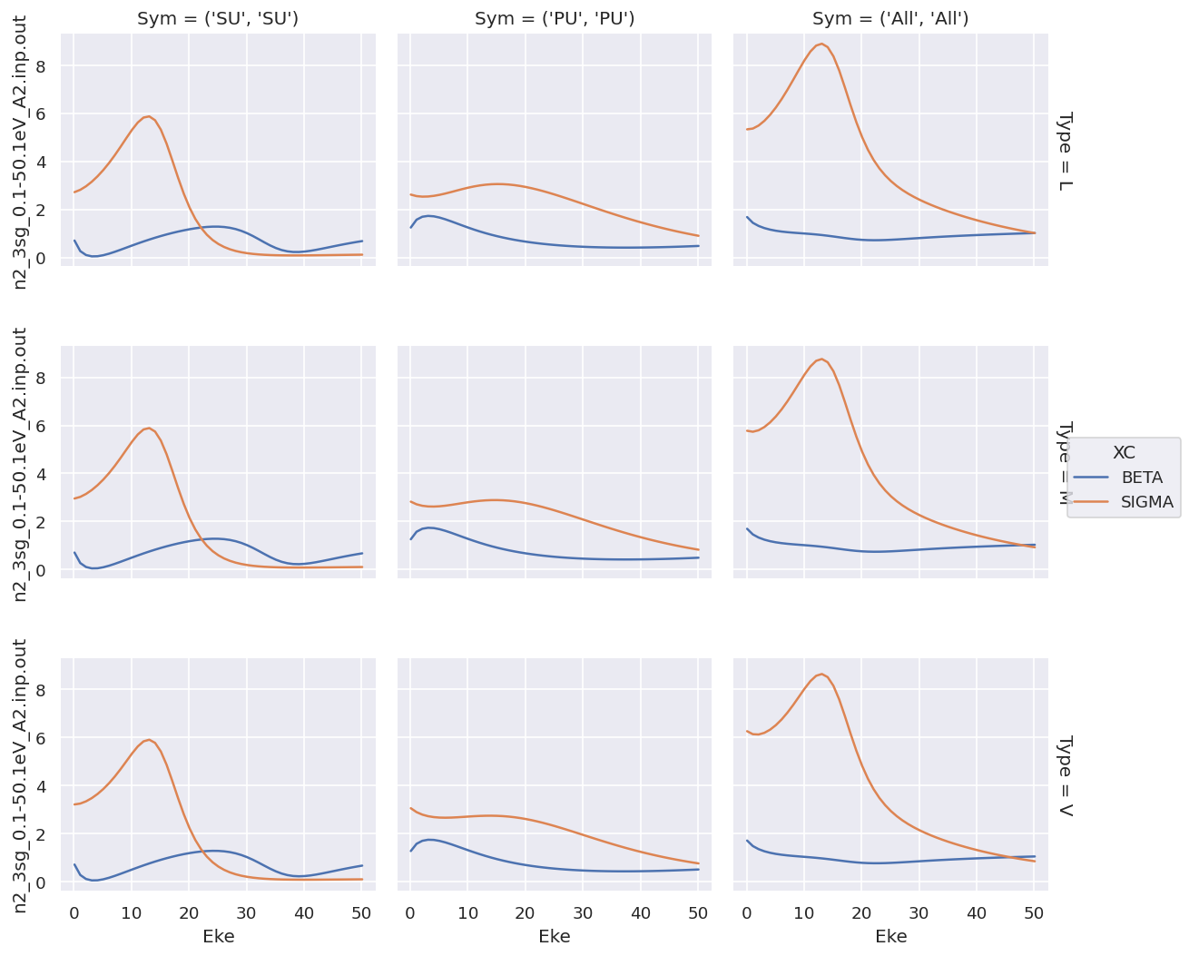
For XC data this provides a complete overview, but the shared y-axis is not ideal for observing the details of the \(\beta\) parameters.
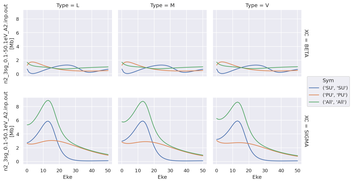
Plotting with faceting by type is similar…
[26]:
# For XS data - this works nicely, except (1) no control over ordering, (2) same y-axis for all data types.
# Plot with faceting
daPlot = ep.matEleSelector(dataXS[0], thres=1e-2, dims = 'Eke', sq = True).squeeze()
# daPlot.pipe(np.abs).plot.line(x='Eke', col='Type', row='XC');
daPlot.plot.line(x='Eke', col='Type', row='XC');
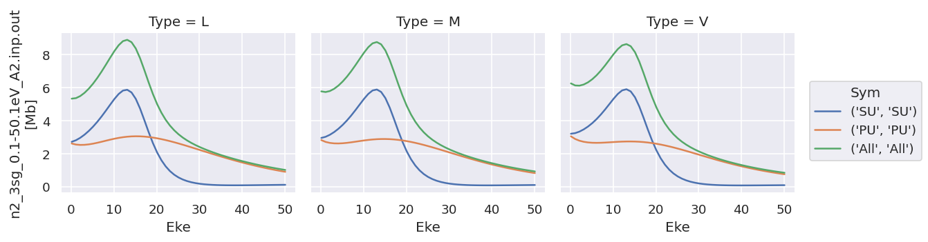
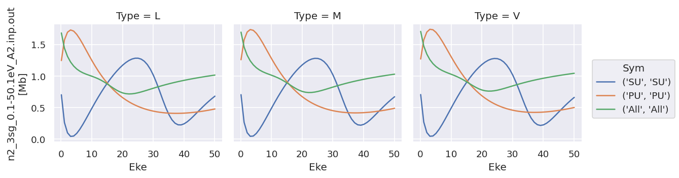
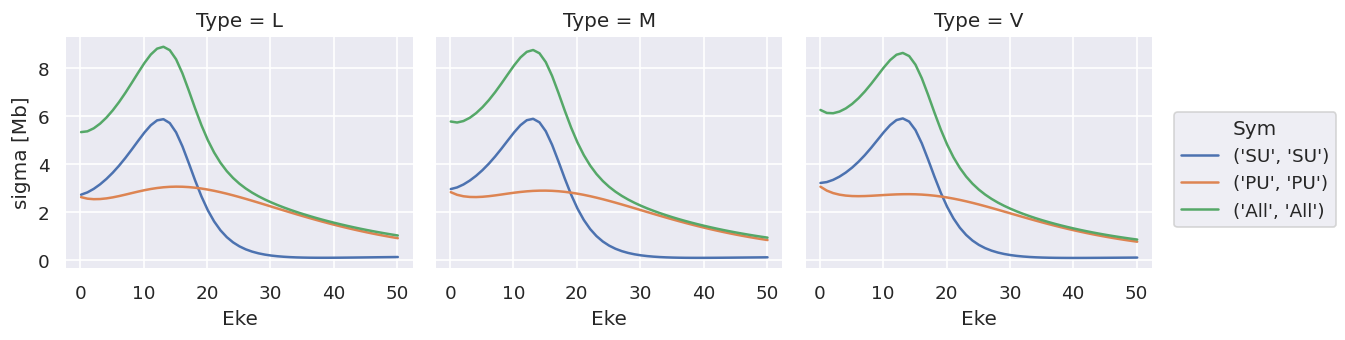
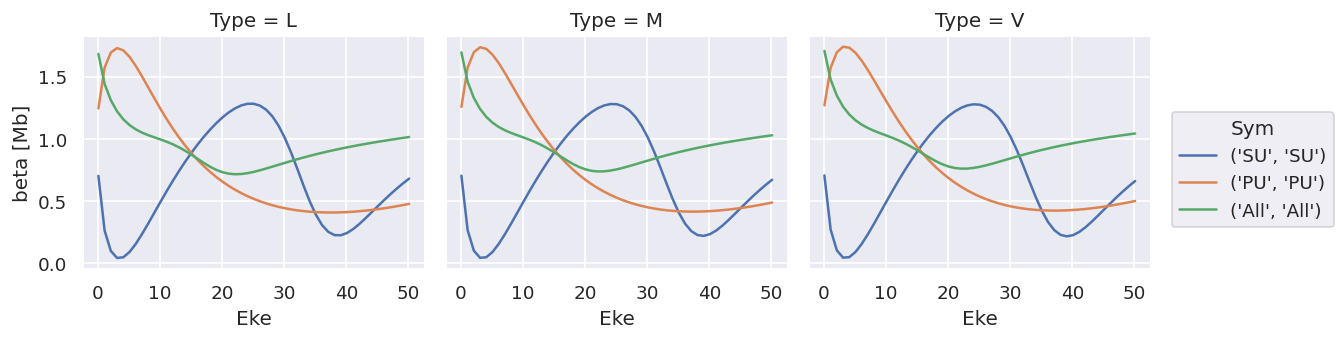
Plotting values independently solves the issue…
[27]:
# Try plotting independently... this allows for independent y-axis scaling over data types.
daPlot.sel({'XC':'SIGMA'}).plot.line(x='Eke', col='Type');
daPlot.sel({'XC':'BETA'}).plot.line(x='Eke', col='Type');
# OK
As does converting the data structure to an Xarray Dataset (rather than Dataarray, which is assumed to hold homogeneous data), see below for more details.
Data reformat & datasets
Main issue with plotting as above is different datatypes (ranges), and also ways to extend to multiple datasets.
[48]:
# Default formatting from ep.readMatEle() is stacked Xarray, with XC as a dimension
dataXS[0].coords
[48]:
Coordinates:
  * Type     (Type) object 'L' 'M' 'V'
    Ehv      (Eke) float64 15.68 16.68 17.68 18.68 ... 62.68 63.68 64.68 65.68
  * XC       (XC) object 'BETA' 'SIGMA'
  * Sym      (Sym) MultiIndex
  - Total    (Sym) object 'SU' 'PU' 'All'
  - Cont     (Sym) object 'SU' 'PU' 'All'
  * Eke      (Eke) float64 0.1 1.1 2.1 3.1 4.1 5.1 ... 46.1 47.1 48.1 49.1 50.1
[51]:
# Test: stack to dataset with XC dim removed.
# This should be correct for keeping datatypes consistent.
# Can then add an additional dim for multiple orbitals, theory vs. expt, etc.
ds = xr.Dataset({'sigma':dataXS[0].sel({'XC':'SIGMA'}).drop('XC'),
                 'beta':dataXS[0].sel({'XC':'BETA'}).drop('XC')})
ds
[51]:
<xarray.Dataset>
Dimensions:  (Eke: 51, Sym: 3, Type: 3)
Coordinates:
  * Type     (Type) object 'L' 'M' 'V'
    Ehv      (Eke) float64 15.68 16.68 17.68 18.68 ... 62.68 63.68 64.68 65.68
  * Sym      (Sym) MultiIndex
  - Total    (Sym) object 'SU' 'PU' 'All'
  - Cont     (Sym) object 'SU' 'PU' 'All'
  * Eke      (Eke) float64 0.1 1.1 2.1 3.1 4.1 5.1 ... 46.1 47.1 48.1 49.1 50.1
Data variables:
    sigma    (Sym, Eke, Type) float64 2.719 2.954 3.209 ... 1.013 0.9229 0.8423
    beta     (Sym, Eke, Type) float64 0.7019 0.7036 0.7053 ... 1.014 1.028 1.042
[55]:
# In this case there's not much direct plotting available, but variables can be called independently as above.
ds['sigma'].plot.line(x='Eke', col='Type');
ds['beta'].plot.line(x='Eke', col='Type');
Note that the units are (incorrectly) labelled as the same for both, this should be fixed!
TODO: change file IO to treat sigma & beta independently!
ep.lmPlot
Designed for multi-dim plotting of matrix elements or \(\beta\) parameters, see plotting routines page for details.
Holoviews
Requires conversion from Xarray data-array or dataset, but then pretty flexible.
Basics here from HV tabular datasets and Gridded Datasets intro pages, plus embelishments.
Issues:
Doesn’t handle multi-indexing in data? Seem to have to unstack() before plotting, but TBD.
Unlinking y-axes currently not working in data-array case, not sure why. Tried a few methods (cell magic, or setting various things in opts - see test notebook for more). Using datasets gets around this however.
With Matplotlib backend
[60]:
# Init - without this no plots will be displayed
hv.extension('matplotlib')


[65]:
# hv_ds = hv.Dataset(dataSet[0].sel({'Type':'L', 'it':1, 'Cont':'SU'}).squeeze().unstack('LM').sel({'m':0,'mu':0}).real)  # OK
# hv_ds = hv.Dataset(dataSet[0].sel({'Type':'L', 'it':1, 'Cont':'SU'}).squeeze().unstack('LM').real)  # OK
hv_ds = hv.Dataset(dataXS[0].sel({'Type':'L'}).unstack(['Sym']).sum(['Total'])) # OK - reduce Sym dims.
# hv_ds = hv.Dataset(dataXS[0].sel({'Type':'L'}).unstack(['Sym']))
print(hv_ds)
:Dataset [XC,Eke,Cont] (n2_3sg_0.1-50.1eV_A2.inp.out)
Basic plotting will generate plots of specified type, with specified key dimensions, plus sliders or lists for other dims.
Note, as before, that the data is here contained in a single ND array.
[66]:
matEplot = hv_ds.to(hv.Curve, kdims=["Eke"])
matEplot.opts(aspect=1)
[66]:
[73]:
# Basic layout functionality for gridding
matEplot = hv_ds.to(hv.Curve, kdims=["Eke"])
matEplot.layout().cols(3)

# matEplot.select(Cont={'SU','PU'}).layout().cols(2)  # Can also use select here to set a subset of plots
[73]:

Generally this isn’t so interesting, since it provides essentially the same functionality as the Xarray.plot() methods, albeit with a little more control.
With bokeh backend
Using HV with Bokeh on the backend is nice, since it provides interactivity in Notebook + HTML output.
[75]:
# Load extension
hv.extension('bokeh')

Firstly, test from Xarray in default format.
[79]:
# hv_ds = hv.Dataset(dataXS[0].sel({'Type':'L'})) # Throws errors at plotting stage - stacked dim issue?
# hv_ds = hv.Dataset(dataXS[0].sel({'Type':'L'}).unstack()) # OK - Sym unstacked, but has some redundancy
hv_ds = hv.Dataset(dataXS[0].sel({'Type':'L'}).unstack().sum('Total')) # OK - reduce Sym dims.
print(hv_ds)
:Dataset [XC,Eke,Cont] (n2_3sg_0.1-50.1eV_A2.inp.out)
[80]:
# Basic - gives menu options as previously
XSplot = hv_ds.to(hv.Curve, kdims=["Eke"], dynamic=False)  # With dynamic=False y-axis is shared, otherwise set to first plot it seems.
XSplot.opts(frame_width=500, frame_height=200, tools=['hover'])  # Set additional options
[80]:
[81]:
# Select + facet with layout()
XSplot.select(XC='BETA',Cont={'SU','PU','All'}).layout().cols(1)
[81]:
[91]:
# Grid
# This is not very useful in current form!
gridded = hv_ds.to(hv.Curve, kdims=["Eke"], dynamic=False).grid('Cont')
gridded
[91]:
[92]:
# Overlay - nice
gridded = hv_ds.to(hv.Curve, kdims=["Eke"], dynamic=False).overlay('Cont')
gridded
[92]:
[94]:
# Layout from a list - not quite woking as it should here, may need to explicitly drop XC dimension?
curve_list   = [hv_ds.select(XC={x}).to(hv.Curve, kdims=["Eke"]) for x in ['SIGMA', 'BETA']]
layout = hv.Layout(curve_list)
layout
[94]:
[100]:
# Overlay + layouts by dim
# Works well, except for shared axis limits issue as before.

hv_ds = hv.Dataset(dataXS[0].sel({'Type':'L'}).unstack().sum('Total')) # OK - reduce Sym dims.
print(hv_ds)

XSplot = hv_ds.to(hv.Curve, kdims=["Eke"], dynamic=False).opts(frame_width=500, tools=['hover'])
# XSplotLayout = XSplot.overlay('Cont')  # Overlay symmetries
XSplotLayout = XSplot.overlay('Cont').layout('XC').cols(1)  # Overlay symmetries
# XSplot.select(XC='BETA',Cont={'SU','PU','All'}).layout().cols(1)   # Select on symmetries

# XSplot.opts(width=500)  # Set additional options
# XSplot
XSplotLayout
:Dataset [XC,Eke,Cont] (n2_3sg_0.1-50.1eV_A2.inp.out)
[100]:
[ ]:
# NEXT: link/unlink plots
# https://www.holoviews.org/user_guide/Linking_Plots.html

# Annotating data
# http://holoviews.org/user_guide/Annotating_Data.html
Data reformat & datasets for HV
Main issue with plotting as above is different datatypes (ranges), and also ways to extend to multiple datasets.
Try Xarray datasets for this capability - previously OK with XeF2 data tests, but currently missing updated file (on AntonJr)… initial noodlings here.
[102]:
# Basic try - stack to dataset with XC dim removed.
# This should be correct for keeping datatypes consistent.
# Can add an additional dim for multiple orbitals, theory vs. expt, etc.
ds = xr.Dataset({'beta':dataXS[0].sel({'XC':'BETA'}).drop('XC'), 'sigma':dataXS[0].sel({'XC':'SIGMA'}).drop('XC')})
ds
[102]:
<xarray.Dataset>
Dimensions:  (Eke: 51, Sym: 3, Type: 3)
Coordinates:
  * Type     (Type) object 'L' 'M' 'V'
    Ehv      (Eke) float64 15.68 16.68 17.68 18.68 ... 62.68 63.68 64.68 65.68
  * Sym      (Sym) MultiIndex
  - Total    (Sym) object 'SU' 'PU' 'All'
  - Cont     (Sym) object 'SU' 'PU' 'All'
  * Eke      (Eke) float64 0.1 1.1 2.1 3.1 4.1 5.1 ... 46.1 47.1 48.1 49.1 50.1
Data variables:
    beta     (Sym, Eke, Type) float64 0.7019 0.7036 0.7053 ... 1.014 1.028 1.042
    sigma    (Sym, Eke, Type) float64 2.719 2.954 3.209 ... 1.013 0.9229 0.8423
[103]:
hv_ds = hv.Dataset(ds.unstack().sum('Total')) # OK - reduce Sym dims.
print(hv_ds)

# Seem to have to subselect on vdims here to define which dataset to plot...?
#  See https://github.com/holoviz/holoviews/issues/2015
# With vdims set
XSplot = hv_ds.to(hv.Curve, kdims=["Eke"], vdims=['sigma'], dynamic=False).opts(frame_width=500, tools=['hover'])
# Try grouping... bsically sets everything to same plotting dim, so not much use here
# XSplot = hv_ds.to(hv.Curve, kdims=["Eke"], vdims=['Cont']).opts(frame_width=500, tools=['hover'])


XSplotLayout = XSplot.overlay('Cont') #.layout()  # Overlay symmetries
# XSplotLayout = XSplot.overlay('Cont').layout('XC').cols(1)  # Overlay symmetries
# XSplot.select(XC='BETA',Cont={'SU','PU','All'}).layout().cols(1)   # Select on symmetries

# XSplot.opts(width=500)  # Set additional options
# XSplot
XSplotLayout  # Only plots 'beta' data??? AH - set vdims
:Dataset [Type,Eke,Cont] (beta,sigma)
[103]:
[104]:
# As above, but with layout too
# THIS IS A BIT OF EFFORT, but now gives plots as desired (linked x-axes, plus selectors)
# Same should work with dataarray and subselection?

dsLayout = hv_ds.to(hv.Curve, kdims=["Eke"], vdims=['sigma'], dynamic=False).overlay('Cont').opts(frame_width=500, tools=['hover'], show_grid=True, padding=0.01) +\
           hv_ds.to(hv.Curve, kdims=["Eke"], vdims=['beta'], dynamic=False).overlay('Cont').opts(frame_width=500, tools=['hover'])
# May want to add padding here, although not sure why it's necessary in this case!

dsLayout.cols(1)  # .opts(frame_width=500, tools=['hover']).overlay('Cont')
[104]:
[105]:
# Try looping

# Set options, then pass below
# sharedOpts = opts.Curve(frame_width=500, tools=['hover'], show_grid=True, padding=0.01)
# As defaults - in this case don't pass below
# Additional: with labelled case for "groups" set below. Way to do this automagically in loop?
#  http://holoviews.org/user_guide/Applying_Customizations.html
sharedOpts = opts.defaults(opts.Curve(frame_width=500, tools=['hover'], show_grid=True, padding=0.01),
                           opts.Curve('L', line_dash='dashed'))

# Loop and set dict
# dsPlotSet = {}
# for vdim in ds.var():
#     dsPlotSet[vdim] = hv_ds.to(hv.Curve, kdims=["Eke"], vdims=vdim, dynamic=False).overlay('Cont').opts(sharedOpts)

# Not sure how to sum these to plot...?
# hvDsPlot = sum(dsPlotSet.values(), [])
# from itertools import chain
# res = list(chain(*dsPlotSet.values()))

# Loop and set object directly...
dsPlotSet = hv.Layout()
for vdim in ds.var():
    # With Type selection box
#     dsPlotSet += hv_ds.to(hv.Curve, kdims=["Eke"], vdims=vdim, dynamic=False).overlay(['Cont']).opts(sharedOpts)

    # With Type overlay
    # This is not bad, although ledgend and style a bit messy.
    # Should style lines by (Sym, Type) for clarity, not sure how just yet.
    dsPlotSet += hv_ds.to(hv.Curve, kdims=["Eke"], vdims=vdim, dynamic=True).overlay(['Cont','Type'])  #.opts(sharedOpts)

    # Loop over type to allow for different plotting options
    # Not working yet - not sure how to init empty object in this case
#     dsPlotSetT = hv.Curve()
#     dsPlotSetT = hv.Layout()
#     for dim in ds[vdim].Type:
#         dsPlotSetT *= hv_ds.to(hv.Curve, kdims=["Eke"], vdims=vdim, dynamic=True, group=dim).overlay(['Cont'])

#     dsPlotSet += dsPlotSetT

dsPlotSet.cols(1)
[105]:
This is very nice, just need to improve a bit by, e.g., line styles by Type or Cont, to simplify plotting & legend.
Note mouse-over values, and linked axes when zooming.
[106]:
print(dsPlotSet)
:Layout
   .NdOverlay.I  :NdOverlay   [Type,Cont]
      :Curve   [Eke]   (beta)
   .NdOverlay.II :NdOverlay   [Type,Cont]
      :Curve   [Eke]   (sigma)
[107]:
# list(ds.var())
ds['beta'].Type
[107]:
<xarray.DataArray 'Type' (Type: 3)>
array(['L', 'M', 'V'], dtype=object)
Coordinates:
  * Type     (Type) object 'L' 'M' 'V'
Try hvplot
Provides interface to Holoviews, use as per Xarray native plotting.
[108]:
import hvplot.xarray
[109]:
# Try XS from dataarray - still throwing errors
# Usually "TypeError: method_wrapper() got an unexpected keyword argument 'per_element'"
# test = dataXS[0].sel({'Type':'L'}).unstack().sum('Total').hvplot.line(x='Eke', col='Cont')
# test

# Try simplifying...
# Working OK with reduced 1D data
# OK
# test = dataXS[0].sel({'Type':'L', 'XC':'SIGMA'}).unstack().sum('Total').sel({'Cont':'PU'}).hvplot.line(x='Eke')
# Nope
# test = dataXS[0].sel({'Type':'L', 'XC':'SIGMA'}).unstack().sum('Total').sel({'Cont':'PU'}).hvplot()
# Works, but junk
# test = dataXS[0].sel({'Type':'L', 'XC':'SIGMA'}).unstack().sum('Total').hvplot.line(x='Eke', y='Cont')
# Nope
# test = dataXS[0].sel({'Type':'L', 'XC':'SIGMA'}).unstack().sum('Total').hvplot.line(x='Eke', y=['SU','PU','All'])
# Nope
# test = dataXS[0].sel({'Type':'L', 'XC':'SIGMA'}).unstack().sum('Total').hvplot.line(x='Eke', groupby='Cont')

# AHHA - use 'by' for overlay dim.
# See https://hvplot.holoviz.org/user_guide/Gridded_Data.html
test = dataXS[0].sel({'Type':'L', 'XC':'SIGMA'}).unstack().sum('Total').hvplot.line(x='Eke', by='Cont')
test2 = dataXS[0].sel({'Type':'L', 'XC':'BETA'}).unstack().sum('Total').hvplot.line(x='Eke', by='Cont', line_dash='dashed' )


(test + test2).cols(1)  # Works, but have linked y-axis again, doh!
# test*test2  # Ugly - overlays everything and screws up legend

# Add a dim... now throws "TypeError: method_wrapper() got an unexpected keyword argument 'per_element'"
# Looks like issue with passing to HV selection widget?
# test = dataXS[0].sel({'XC':'SIGMA'}).unstack().sum('Total').hvplot.line(x='Eke', by='Cont')
# test
[109]:
Currently having issue with going further on this - see test notebook.
Versions
[112]:
import scooby
scooby.Report(additional=['epsproc', 'holoviews', 'hvplot', 'xarray', 'matplotlib', 'bokeh'])
[112]:
| Fri Jul 03 15:39:14 2020 EDT | |||||
| OS | Linux | CPU(s) | 4 | Machine | x86_64 |
| Architecture | 64bit | Environment | Jupyter | ||
| Python 3.7.6 (default, Jan 8 2020, 19:59:22) [GCC 7.3.0] | |||||
| epsproc | 1.2.5-dev | holoviews | 1.12.6 | hvplot | 0.6.0 |
| xarray | 0.13.0 | matplotlib | 3.2.0 | bokeh | 1.4.0 |
| numpy | 1.18.1 | scipy | 1.3.1 | IPython | 7.13.0 |
| scooby | 0.5.5 | ||||
| Intel(R) Math Kernel Library Version 2019.0.4 Product Build 20190411 for Intel(R) 64 architecture applications | |||||
[ ]: