ePSproc - basic plotting development, XC version
03/07/20, simplified version to look at XC data and betas only.
28/06/20, v1 http://localhost:8888/notebooks/github/ePSproc/epsproc/tests/plottingDev/basicPlotting_dev_280620.ipynb
Aims
- Improve/automate basic plotting routines (currently using Xarray.plot.line() for the most part).
- Plot format & styling (use Seaborn?)
- Test & implement plotting over multiple Xarrays for data comparisons. (E.g. XeF2 plotting, updates to follow when AntonJr is back up.)
- Conversion to Xarray datasets?
- Use Holoviews?
- Improve export formats
- HV + Bokeh for interactive HTML outputs (e.g. benchmarks graphs via xyzpy).
Setup
[2]:
# Standard libs
import sys
import os
from pathlib import Path
import numpy as np
import xarray as xr

from datetime import datetime as dt
timeString = dt.now()

# For reporting
import scooby
# scooby.Report(additional=['holoviews', 'hvplot', 'xarray', 'matplotlib', 'bokeh'])
# TODO: set up function for this, see https://github.com/banesullivan/scooby
[3]:
# Installed package version
# import epsproc as ep

# ePSproc test codebase (local)
if sys.platform == "win32":
    modPath = r'D:\code\github\ePSproc'  # Win test machine
else:
    modPath = r'/home/femtolab/github/ePSproc/'  # Linux test machine

sys.path.append(modPath)
import epsproc as ep
* plotly not found, plotly plots not available.
* pyevtk not found, VTK export not available.
[4]:
# Plotting libs
# Optional - set seaborn for plot styling
import seaborn as sns
sns.set_context("paper")  # "paper", "talk", "poster", sets relative scale of elements
                        # https://seaborn.pydata.org/tutorial/aesthetics.html
# sns.set(rc={'figure.figsize':(11.7,8.27)})  # Set figure size explicitly (inch)
                        # https://stackoverflow.com/questions/31594549/how-do-i-change-the-figure-size-for-a-seaborn-plot
                        # Wraps Matplotlib rcParams, https://matplotlib.org/tutorials/introductory/customizing.html
sns.set(rc={'figure.dpi':(120)})

from matplotlib import pyplot as plt  # For addtional plotting functionality
# import bokeh

import holoviews as hv
from holoviews import opts
Load test data
[5]:
# Load data from modPath\data
dataPath = os.path.join(modPath, 'data', 'photoionization')
dataFile = os.path.join(dataPath, 'n2_3sg_0.1-50.1eV_A2.inp.out')  # Set for sample N2 data for testing

# Scan data file
dataSet = ep.readMatEle(fileIn = dataFile)
dataXS = ep.readMatEle(fileIn = dataFile, recordType = 'CrossSection')  # XS info currently not set in NO2 sample file.
*** ePSproc readMatEle(): scanning files for DumpIdy segments.

*** Scanning file(s)
['/home/femtolab/github/ePSproc/data/photoionization/n2_3sg_0.1-50.1eV_A2.inp.out']

*** Reading ePS output file:  /home/femtolab/github/ePSproc/data/photoionization/n2_3sg_0.1-50.1eV_A2.inp.out
Expecting 51 energy points.
Expecting 2 symmetries.
Scanning CrossSection segments.
Expecting 102 DumpIdy segments.
Found 102 dumpIdy segments (sets of matrix elements).

Processing segments to Xarrays...
Processed 102 sets of DumpIdy file segments, (0 blank)
*** ePSproc readMatEle(): scanning files for CrossSection segments.

*** Scanning file(s)
['/home/femtolab/github/ePSproc/data/photoionization/n2_3sg_0.1-50.1eV_A2.inp.out']

*** Reading ePS output file:  /home/femtolab/github/ePSproc/data/photoionization/n2_3sg_0.1-50.1eV_A2.inp.out
Expecting 51 energy points.
Expecting 2 symmetries.
Scanning CrossSection segments.
Expecting 3 CrossSection segments.
Found 3 CrossSection segments (sets of results).
Processed 3 sets of CrossSection file segments, (0 blank)
Xarray plotting
- Xarray wraps Matplotlib functionality. (And can be modified using Matplotlib calls, and will pick up Seaborn styling if set.)
- Easy to use, supports line and surface plots, with faceting.
- Doesn’t support high dimensionality directly, need to subselect and/or facet and then pass set of 1D or 2D values.
- Not interactive in Jupyter Notebook, or HTML, output.
[8]:
# Plot with faceting on symmetry
daPlot = ep.matEleSelector(dataXS[0], thres=1e-2, dims = 'Eke', sq = True).squeeze()
daPlot.plot.line(x='Eke', col='Sym', row='Type');
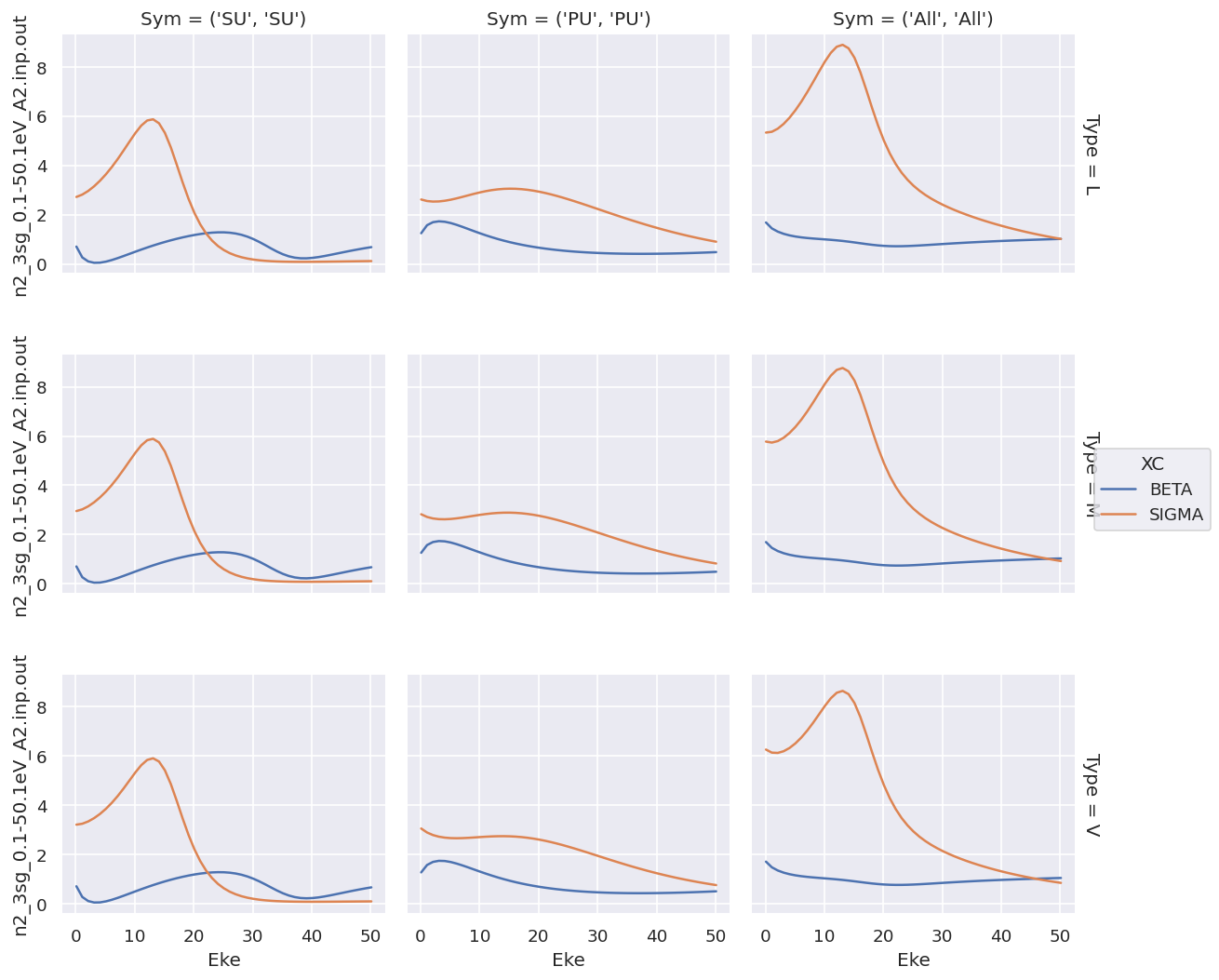
For XC data this provides a complete overview, but the shared y-axis is not ideal for observing the details of the \(\beta\) parameters.
Plotting with faceting by type is similar…
[26]:
# For XS data - this works nicely, except (1) no control over ordering, (2) same y-axis for all data types.
# Plot with faceting
daPlot = ep.matEleSelector(dataXS[0], thres=1e-2, dims = 'Eke', sq = True).squeeze()
# daPlot.pipe(np.abs).plot.line(x='Eke', col='Type', row='XC');
daPlot.plot.line(x='Eke', col='Type', row='XC');
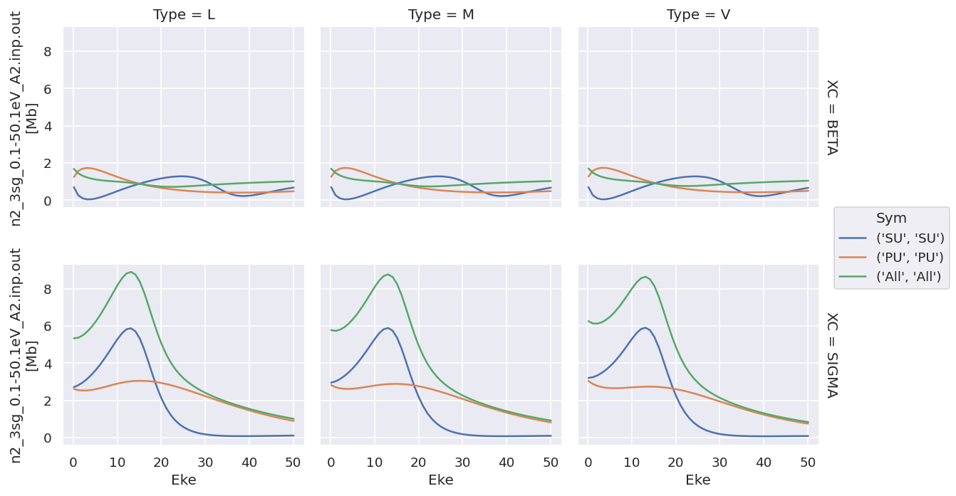
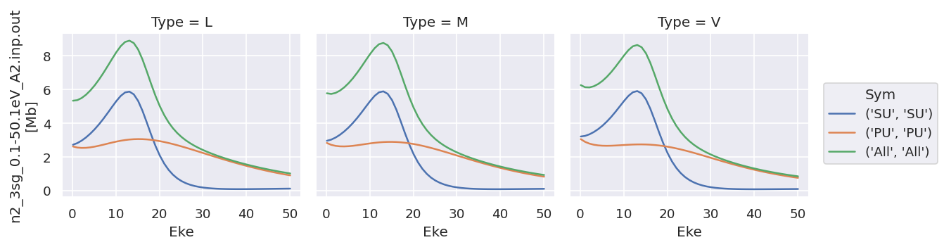
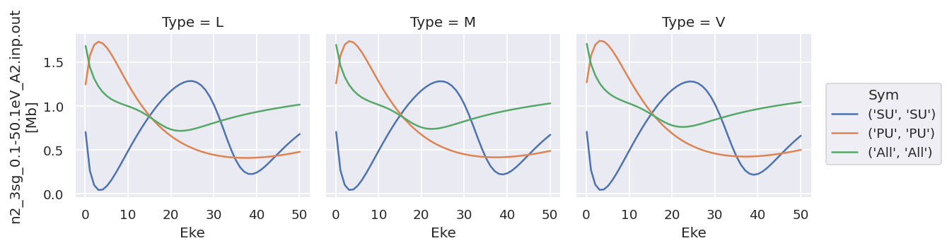
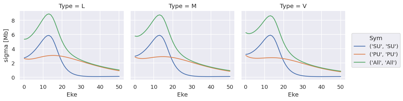
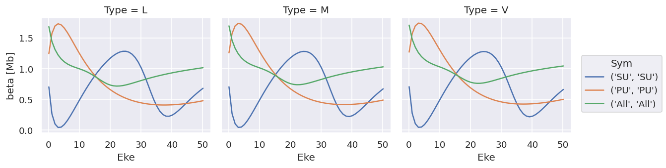
Plotting values independently solves the issue…
[27]:
# Try plotting independently... this allows for independent y-axis scaling over data types.
daPlot.sel({'XC':'SIGMA'}).plot.line(x='Eke', col='Type');
daPlot.sel({'XC':'BETA'}).plot.line(x='Eke', col='Type');
# OK
As does converting the data structure to an Xarray Dataset (rather than Dataarray, which is assumed to hold homogeneous data), see below for more details.
Data reformat & datasets
Main issue with plotting as above is different datatypes (ranges), and also ways to extend to multiple datasets.
[48]:
# Default formatting from ep.readMatEle() is stacked Xarray, with XC as a dimension
dataXS[0].coords
[48]:
Coordinates:
  * Type     (Type) object 'L' 'M' 'V'
    Ehv      (Eke) float64 15.68 16.68 17.68 18.68 ... 62.68 63.68 64.68 65.68
  * XC       (XC) object 'BETA' 'SIGMA'
  * Sym      (Sym) MultiIndex
  - Total    (Sym) object 'SU' 'PU' 'All'
  - Cont     (Sym) object 'SU' 'PU' 'All'
  * Eke      (Eke) float64 0.1 1.1 2.1 3.1 4.1 5.1 ... 46.1 47.1 48.1 49.1 50.1
[51]:
# Test: stack to dataset with XC dim removed.
# This should be correct for keeping datatypes consistent.
# Can then add an additional dim for multiple orbitals, theory vs. expt, etc.
ds = xr.Dataset({'sigma':dataXS[0].sel({'XC':'SIGMA'}).drop('XC'),
                 'beta':dataXS[0].sel({'XC':'BETA'}).drop('XC')})
ds
[51]:
<xarray.Dataset>
Dimensions:  (Eke: 51, Sym: 3, Type: 3)
Coordinates:
  * Type     (Type) object 'L' 'M' 'V'
    Ehv      (Eke) float64 15.68 16.68 17.68 18.68 ... 62.68 63.68 64.68 65.68
  * Sym      (Sym) MultiIndex
  - Total    (Sym) object 'SU' 'PU' 'All'
  - Cont     (Sym) object 'SU' 'PU' 'All'
  * Eke      (Eke) float64 0.1 1.1 2.1 3.1 4.1 5.1 ... 46.1 47.1 48.1 49.1 50.1
Data variables:
    sigma    (Sym, Eke, Type) float64 2.719 2.954 3.209 ... 1.013 0.9229 0.8423
    beta     (Sym, Eke, Type) float64 0.7019 0.7036 0.7053 ... 1.014 1.028 1.042
[55]:
# In this case there's not much direct plotting available, but variables can be called independently as above.
ds['sigma'].plot.line(x='Eke', col='Type');
ds['beta'].plot.line(x='Eke', col='Type');
Note that the units are (incorrectly) labelled as the same for both, this should be fixed!
TODO: change file IO to treat sigma & beta independently!
ep.lmPlot
Designed for multi-dim plotting of matrix elements or \(\beta\) parameters, see plotting routines page for details.
Holoviews
Requires conversion from Xarray data-array or dataset, but then pretty flexible.
Basics here from HV tabular datasets and Gridded Datasets intro pages, plus embelishments.
Issues:
- Doesn’t handle multi-indexing in data? Seem to have to unstack() before plotting, but TBD.
- Unlinking y-axes currently not working in data-array case, not sure why. Tried a few methods (cell magic, or setting various things in opts - see test notebook for more). Using datasets gets around this however.
With Matplotlib backend
[60]:
# Init - without this no plots will be displayed
hv.extension('matplotlib')


[65]:
# hv_ds = hv.Dataset(dataSet[0].sel({'Type':'L', 'it':1, 'Cont':'SU'}).squeeze().unstack('LM').sel({'m':0,'mu':0}).real)  # OK
# hv_ds = hv.Dataset(dataSet[0].sel({'Type':'L', 'it':1, 'Cont':'SU'}).squeeze().unstack('LM').real)  # OK
hv_ds = hv.Dataset(dataXS[0].sel({'Type':'L'}).unstack(['Sym']).sum(['Total'])) # OK - reduce Sym dims.
# hv_ds = hv.Dataset(dataXS[0].sel({'Type':'L'}).unstack(['Sym']))
print(hv_ds)
:Dataset [XC,Eke,Cont] (n2_3sg_0.1-50.1eV_A2.inp.out)
Basic plotting will generate plots of specified type, with specified key dimensions, plus sliders or lists for other dims.
Note, as before, that the data is here contained in a single ND array.
[66]:
matEplot = hv_ds.to(hv.Curve, kdims=["Eke"])
matEplot.opts(aspect=1)
[66]:
[73]:
# Basic layout functionality for gridding
matEplot = hv_ds.to(hv.Curve, kdims=["Eke"])
matEplot.layout().cols(3)

# matEplot.select(Cont={'SU','PU'}).layout().cols(2)  # Can also use select here to set a subset of plots
[73]:

Generally this isn’t so interesting, since it provides essentially the same functionality as the Xarray.plot() methods, albeit with a little more control.
With bokeh backend
Using HV with Bokeh on the backend is nice, since it provides interactivity in Notebook + HTML output.
[75]:
# Load extension
hv.extension('bokeh')

Firstly, test from Xarray in default format.
[79]:
# hv_ds = hv.Dataset(dataXS[0].sel({'Type':'L'})) # Throws errors at plotting stage - stacked dim issue?
# hv_ds = hv.Dataset(dataXS[0].sel({'Type':'L'}).unstack()) # OK - Sym unstacked, but has some redundancy
hv_ds = hv.Dataset(dataXS[0].sel({'Type':'L'}).unstack().sum('Total')) # OK - reduce Sym dims.
print(hv_ds)
:Dataset [XC,Eke,Cont] (n2_3sg_0.1-50.1eV_A2.inp.out)
[80]:
# Basic - gives menu options as previously
XSplot = hv_ds.to(hv.Curve, kdims=["Eke"], dynamic=False)  # With dynamic=False y-axis is shared, otherwise set to first plot it seems.
XSplot.opts(frame_width=500, frame_height=200, tools=['hover'])  # Set additional options
[80]:
[81]:
# Select + facet with layout()
XSplot.select(XC='BETA',Cont={'SU','PU','All'}).layout().cols(1)
[81]:
[91]:
# Grid
# This is not very useful in current form!
gridded = hv_ds.to(hv.Curve, kdims=["Eke"], dynamic=False).grid('Cont')
gridded
[91]:
[92]:
# Overlay - nice
gridded = hv_ds.to(hv.Curve, kdims=["Eke"], dynamic=False).overlay('Cont')
gridded
[92]:
[94]:
# Layout from a list - not quite woking as it should here, may need to explicitly drop XC dimension?
curve_list   = [hv_ds.select(XC={x}).to(hv.Curve, kdims=["Eke"]) for x in ['SIGMA', 'BETA']]
layout = hv.Layout(curve_list)
layout
[94]:
[100]:
# Overlay + layouts by dim
# Works well, except for shared axis limits issue as before.

hv_ds = hv.Dataset(dataXS[0].sel({'Type':'L'}).unstack().sum('Total')) # OK - reduce Sym dims.
print(hv_ds)

XSplot = hv_ds.to(hv.Curve, kdims=["Eke"], dynamic=False).opts(frame_width=500, tools=['hover'])
# XSplotLayout = XSplot.overlay('Cont')  # Overlay symmetries
XSplotLayout = XSplot.overlay('Cont').layout('XC').cols(1)  # Overlay symmetries
# XSplot.select(XC='BETA',Cont={'SU','PU','All'}).layout().cols(1)   # Select on symmetries

# XSplot.opts(width=500)  # Set additional options
# XSplot
XSplotLayout
:Dataset [XC,Eke,Cont] (n2_3sg_0.1-50.1eV_A2.inp.out)
[100]:
[ ]:
# NEXT: link/unlink plots
# https://www.holoviews.org/user_guide/Linking_Plots.html

# Annotating data
# http://holoviews.org/user_guide/Annotating_Data.html
Data reformat & datasets for HV
Main issue with plotting as above is different datatypes (ranges), and also ways to extend to multiple datasets.
Try Xarray datasets for this capability - previously OK with XeF2 data tests, but currently missing updated file (on AntonJr)… initial noodlings here.
[102]:
# Basic try - stack to dataset with XC dim removed.
# This should be correct for keeping datatypes consistent.
# Can add an additional dim for multiple orbitals, theory vs. expt, etc.
ds = xr.Dataset({'beta':dataXS[0].sel({'XC':'BETA'}).drop('XC'), 'sigma':dataXS[0].sel({'XC':'SIGMA'}).drop('XC')})
ds
[102]:
<xarray.Dataset>
Dimensions:  (Eke: 51, Sym: 3, Type: 3)
Coordinates:
  * Type     (Type) object 'L' 'M' 'V'
    Ehv      (Eke) float64 15.68 16.68 17.68 18.68 ... 62.68 63.68 64.68 65.68
  * Sym      (Sym) MultiIndex
  - Total    (Sym) object 'SU' 'PU' 'All'
  - Cont     (Sym) object 'SU' 'PU' 'All'
  * Eke      (Eke) float64 0.1 1.1 2.1 3.1 4.1 5.1 ... 46.1 47.1 48.1 49.1 50.1
Data variables:
    beta     (Sym, Eke, Type) float64 0.7019 0.7036 0.7053 ... 1.014 1.028 1.042
    sigma    (Sym, Eke, Type) float64 2.719 2.954 3.209 ... 1.013 0.9229 0.8423
[103]:
hv_ds = hv.Dataset(ds.unstack().sum('Total')) # OK - reduce Sym dims.
print(hv_ds)

# Seem to have to subselect on vdims here to define which dataset to plot...?
#  See https://github.com/holoviz/holoviews/issues/2015
# With vdims set
XSplot = hv_ds.to(hv.Curve, kdims=["Eke"], vdims=['sigma'], dynamic=False).opts(frame_width=500, tools=['hover'])
# Try grouping... bsically sets everything to same plotting dim, so not much use here
# XSplot = hv_ds.to(hv.Curve, kdims=["Eke"], vdims=['Cont']).opts(frame_width=500, tools=['hover'])


XSplotLayout = XSplot.overlay('Cont') #.layout()  # Overlay symmetries
# XSplotLayout = XSplot.overlay('Cont').layout('XC').cols(1)  # Overlay symmetries
# XSplot.select(XC='BETA',Cont={'SU','PU','All'}).layout().cols(1)   # Select on symmetries

# XSplot.opts(width=500)  # Set additional options
# XSplot
XSplotLayout  # Only plots 'beta' data??? AH - set vdims
:Dataset [Type,Eke,Cont] (beta,sigma)
[103]:
[104]:
# As above, but with layout too
# THIS IS A BIT OF EFFORT, but now gives plots as desired (linked x-axes, plus selectors)
# Same should work with dataarray and subselection?

dsLayout = hv_ds.to(hv.Curve, kdims=["Eke"], vdims=['sigma'], dynamic=False).overlay('Cont').opts(frame_width=500, tools=['hover'], show_grid=True, padding=0.01) +\
           hv_ds.to(hv.Curve, kdims=["Eke"], vdims=['beta'], dynamic=False).overlay('Cont').opts(frame_width=500, tools=['hover'])
# May want to add padding here, although not sure why it's necessary in this case!

dsLayout.cols(1)  # .opts(frame_width=500, tools=['hover']).overlay('Cont')
[104]:
[105]:
# Try looping

# Set options, then pass below
# sharedOpts = opts.Curve(frame_width=500, tools=['hover'], show_grid=True, padding=0.01)
# As defaults - in this case don't pass below
# Additional: with labelled case for "groups" set below. Way to do this automagically in loop?
#  http://holoviews.org/user_guide/Applying_Customizations.html
sharedOpts = opts.defaults(opts.Curve(frame_width=500, tools=['hover'], show_grid=True, padding=0.01),
                           opts.Curve('L', line_dash='dashed'))

# Loop and set dict
# dsPlotSet = {}
# for vdim in ds.var():
#     dsPlotSet[vdim] = hv_ds.to(hv.Curve, kdims=["Eke"], vdims=vdim, dynamic=False).overlay('Cont').opts(sharedOpts)

# Not sure how to sum these to plot...?
# hvDsPlot = sum(dsPlotSet.values(), [])
# from itertools import chain
# res = list(chain(*dsPlotSet.values()))

# Loop and set object directly...
dsPlotSet = hv.Layout()
for vdim in ds.var():
    # With Type selection box
#     dsPlotSet += hv_ds.to(hv.Curve, kdims=["Eke"], vdims=vdim, dynamic=False).overlay(['Cont']).opts(sharedOpts)

    # With Type overlay
    # This is not bad, although ledgend and style a bit messy.
    # Should style lines by (Sym, Type) for clarity, not sure how just yet.
    dsPlotSet += hv_ds.to(hv.Curve, kdims=["Eke"], vdims=vdim, dynamic=True).overlay(['Cont','Type'])  #.opts(sharedOpts)

    # Loop over type to allow for different plotting options
    # Not working yet - not sure how to init empty object in this case
#     dsPlotSetT = hv.Curve()
#     dsPlotSetT = hv.Layout()
#     for dim in ds[vdim].Type:
#         dsPlotSetT *= hv_ds.to(hv.Curve, kdims=["Eke"], vdims=vdim, dynamic=True, group=dim).overlay(['Cont'])

#     dsPlotSet += dsPlotSetT

dsPlotSet.cols(1)
[105]:
This is very nice, just need to improve a bit by, e.g., line styles by Type or Cont, to simplify plotting & legend.
Note mouse-over values, and linked axes when zooming.
[106]:
print(dsPlotSet)
:Layout
   .NdOverlay.I  :NdOverlay   [Type,Cont]
      :Curve   [Eke]   (beta)
   .NdOverlay.II :NdOverlay   [Type,Cont]
      :Curve   [Eke]   (sigma)
[107]:
# list(ds.var())
ds['beta'].Type
[107]:
<xarray.DataArray 'Type' (Type: 3)>
array(['L', 'M', 'V'], dtype=object)
Coordinates:
  * Type     (Type) object 'L' 'M' 'V'
Try hvplot
Provides interface to Holoviews, use as per Xarray native plotting.
[108]:
import hvplot.xarray
[109]:
# Try XS from dataarray - still throwing errors
# Usually "TypeError: method_wrapper() got an unexpected keyword argument 'per_element'"
# test = dataXS[0].sel({'Type':'L'}).unstack().sum('Total').hvplot.line(x='Eke', col='Cont')
# test

# Try simplifying...
# Working OK with reduced 1D data
# OK
# test = dataXS[0].sel({'Type':'L', 'XC':'SIGMA'}).unstack().sum('Total').sel({'Cont':'PU'}).hvplot.line(x='Eke')
# Nope
# test = dataXS[0].sel({'Type':'L', 'XC':'SIGMA'}).unstack().sum('Total').sel({'Cont':'PU'}).hvplot()
# Works, but junk
# test = dataXS[0].sel({'Type':'L', 'XC':'SIGMA'}).unstack().sum('Total').hvplot.line(x='Eke', y='Cont')
# Nope
# test = dataXS[0].sel({'Type':'L', 'XC':'SIGMA'}).unstack().sum('Total').hvplot.line(x='Eke', y=['SU','PU','All'])
# Nope
# test = dataXS[0].sel({'Type':'L', 'XC':'SIGMA'}).unstack().sum('Total').hvplot.line(x='Eke', groupby='Cont')

# AHHA - use 'by' for overlay dim.
# See https://hvplot.holoviz.org/user_guide/Gridded_Data.html
test = dataXS[0].sel({'Type':'L', 'XC':'SIGMA'}).unstack().sum('Total').hvplot.line(x='Eke', by='Cont')
test2 = dataXS[0].sel({'Type':'L', 'XC':'BETA'}).unstack().sum('Total').hvplot.line(x='Eke', by='Cont', line_dash='dashed' )


(test + test2).cols(1)  # Works, but have linked y-axis again, doh!
# test*test2  # Ugly - overlays everything and screws up legend

# Add a dim... now throws "TypeError: method_wrapper() got an unexpected keyword argument 'per_element'"
# Looks like issue with passing to HV selection widget?
# test = dataXS[0].sel({'XC':'SIGMA'}).unstack().sum('Total').hvplot.line(x='Eke', by='Cont')
# test
[109]:
Currently having issue with going further on this - see test notebook.
Versions
[112]:
import scooby
scooby.Report(additional=['epsproc', 'holoviews', 'hvplot', 'xarray', 'matplotlib', 'bokeh'])
[112]:
| Fri Jul 03 15:39:14 2020 EDT | |||||
| OS | Linux | CPU(s) | 4 | Machine | x86_64 |
| Architecture | 64bit | Environment | Jupyter | ||
| Python 3.7.6 (default, Jan 8 2020, 19:59:22) [GCC 7.3.0] | |||||
| epsproc | 1.2.5-dev | holoviews | 1.12.6 | hvplot | 0.6.0 |
| xarray | 0.13.0 | matplotlib | 3.2.0 | bokeh | 1.4.0 |
| numpy | 1.18.1 | scipy | 1.3.1 | IPython | 7.13.0 |
| scooby | 0.5.5 | ||||
| Intel(R) Math Kernel Library Version 2019.0.4 Product Build 20190411 for Intel(R) 64 architecture applications | |||||
[ ]: